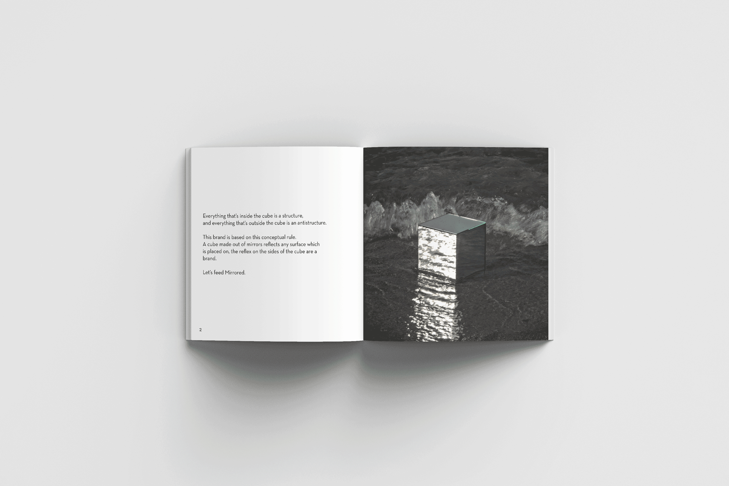

Mirrored
A project based on minimalism, Japanese white space perception and the relationship between mirrors and humans. It is a critique towards capitalism and environment in today’s society. Mirrored acts as a “non brand” because it doesn’t sell anything except the idea that humans have to slow down.
This brand invites to reflect more about a sustainable lifestyle, which in the end should bring a stronger connection between humans and the environment.
It is a research project which conveys different creative disciplines towards a unified identity.
Brand building blocks
For the basic visual style, as the mark represents a simple shape, the identity is really essential. Neutraface was chosen as a type because it is open, unobtrusive and has a linear geometry.
Due to the simple identity, a color palette consisting of black and white was used to enhance the minimalistic approach. The photography kit consists in a hero shot and a set of outdoor images showing the product in a natural environment.


Manifesto, stationary and catalogue
Mirrored’s philosophy is to be totally honest and transparent. The brand manifesto is an open letter that invites people reading it to think about how our daily actions have consequences on the relationship between society and environment.
Stationary and catalogue were designed to support the brand’s vision. All the visual building blocks come together in the printed catalogue which stimulates the reader to take action.