
Care
International Insurance Broker
Care is an Italian insurance broker, with its headquarters in the business district of Milanofiori (Assago, Milan) and many correspondents in key-countries across the globe.
Our collaboration has started at the end of 2016. In the beginning we started working on some general communication material, after one year the company asked me also to think about refreshing the identity so I started working on it. Till now all the projects executed acted as a preparation for the official rebranding which will be launched in fall 2021.
Visual elements
At the beginning of the restyling process only one color was considered, a marine blue hue which was really classic and the font was Gotham.
The newer visual elements better reflected Care’s goal to stand out in the insurance broking market: extending the color palette, choosing Biotif as a font and a main pattern.

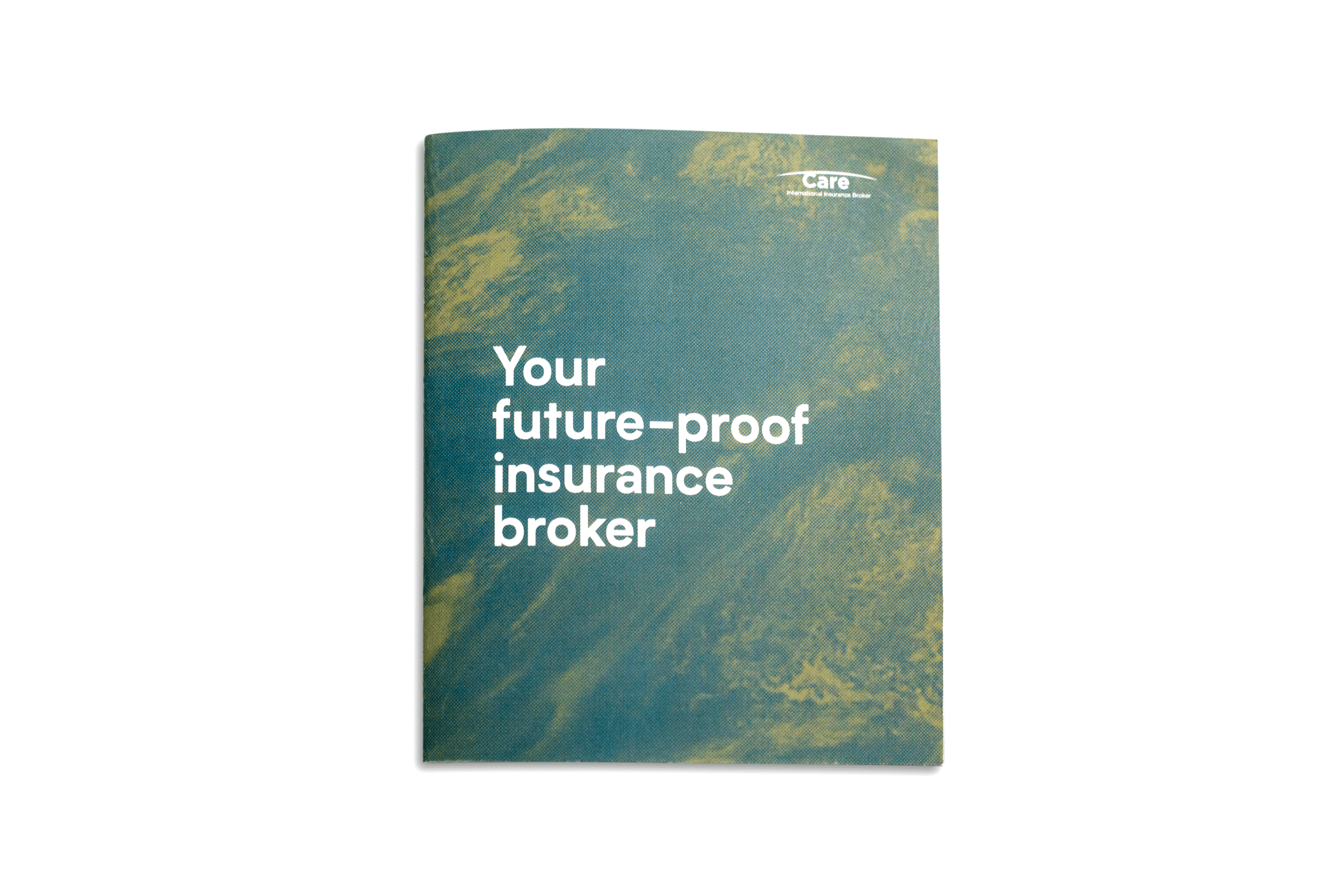
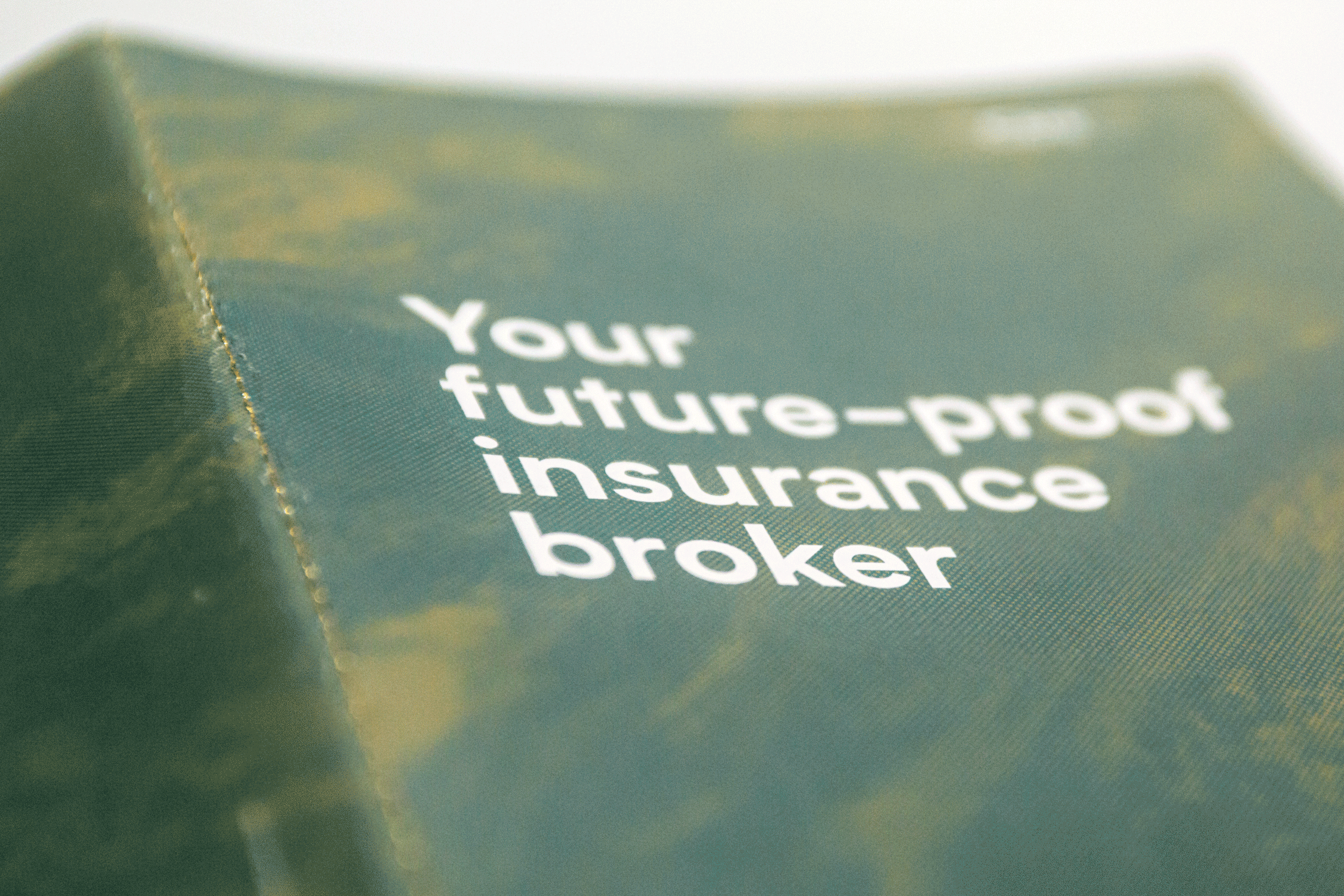
A globe with halftone effect gives to the overall identity a more scientific, technical and organic feel. By enlarging and cropping the image you can get different patterns that can be used in different applications.

Moodboard
The aim of this moodboard is to give a view of Care as a global player with a dynamic attitude in the insurance broking market.

Images: Unsplash
Stationary
Below is an application of all the visual elements. The halftone pattern gives Care’s printed material an organic and distinctive look.

Iconography
The icons were designed to be used in the first place in a digital environment and later in printing. Every icon is carefully designed to convey a service, concept or tool. They were developed to support the brands growing identity.

Sub brands
Over the years Care extended its reach on the market with additional services. These sub brands, which were designed carefully, had to communicate to the client a solid and high quality service.

Logotype for cybercrime coverage service (2018)

Mark for sustainable transport service (2020)

Mark for employees welfare service (2020)
Incoterms
By using the design elements from the Care visual language, Incoterms card was redesigned with clear aesthetics and a short description on the back enhancing the core services.

Service Catalogue
Usually, in the insurance broking market, service catalogues have a very outdated approach and style. For this catalogue we wanted to design something totally different, so we approached it with a magazine-like design which is a mix of inspiring texts, abstract images and illustrated pictograms.