
Milano Brand
Concept
This is a study about how Milano could be rebranded. The existing mark is a modern rendition of a heraldic symbol which tells a classic story.
With this project I wanted to try a different approach. To arrive at the proposal I’ve researched and studied the main symbols of the city and its region.

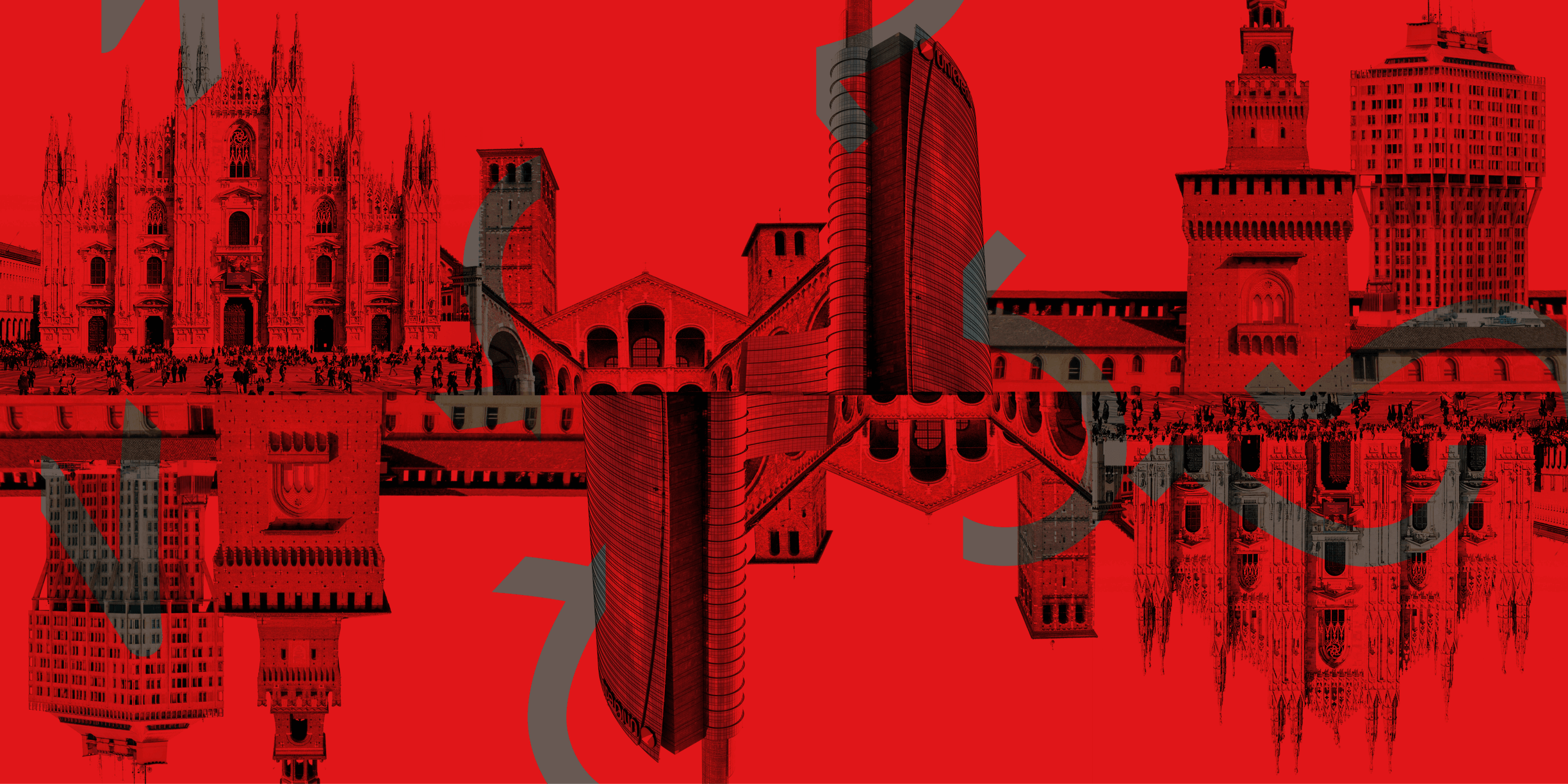
Milan is a city that acts like a metropolis — but it is indeed composed by small ‘sub-towns’ that are held together by the multicultural tissue. This makes it a city prone to a very dynamic and expanding attitude, although remaining somehow classic.
Image: Hans Leopold Helm

Poster and folding map
To support the new branding I designed a poster with a provocative copywriting — that inspires about Milan as a growing and dynamic city. To support the tourism I created an A2 folding map poster which is designed for walking.


Moodboard
The images chosen for this moodboard are a collection containing precise shapes, colors and buildings found in Milan. At its core the city is really fast paced. With this tool I wanted to understand an initial style inspiration.

Symbols
With the help of the moodboard and on-location research I identified the most important symbols of Milan and its region:
(1) The Camuna Rose: the most ancient graphic symbol which dates back to the Iron Age
(2) The Duomo: gothic cathedral that represents the centre of the city and it is an international symbol
(3) The Sforza shield: a witness of the Renaissance period in Milan
(4) The medieval urban map: since the city is build around the ancient walls its layout is concentric

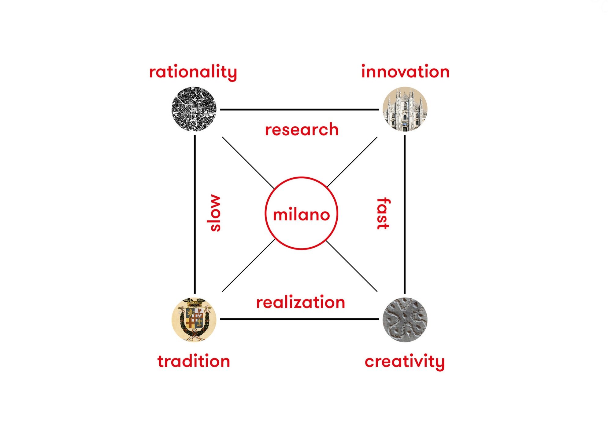
Semiotics
After defining the symbols of the city I have used a semiotic square to create signification. Every term faces its opposite to generate a meaning.
Mark
The new mark pictured as an ‘M’ monogram wants to give the city an elegant and dynamic symbol which carries a strong meaning — so that the city can stand out in the global city tourism market.


A visual metaphor has been used for resolving the mark. A blend between the Duomo cathedral and the Camuna rose was used as a base grid for an “M” monogram.